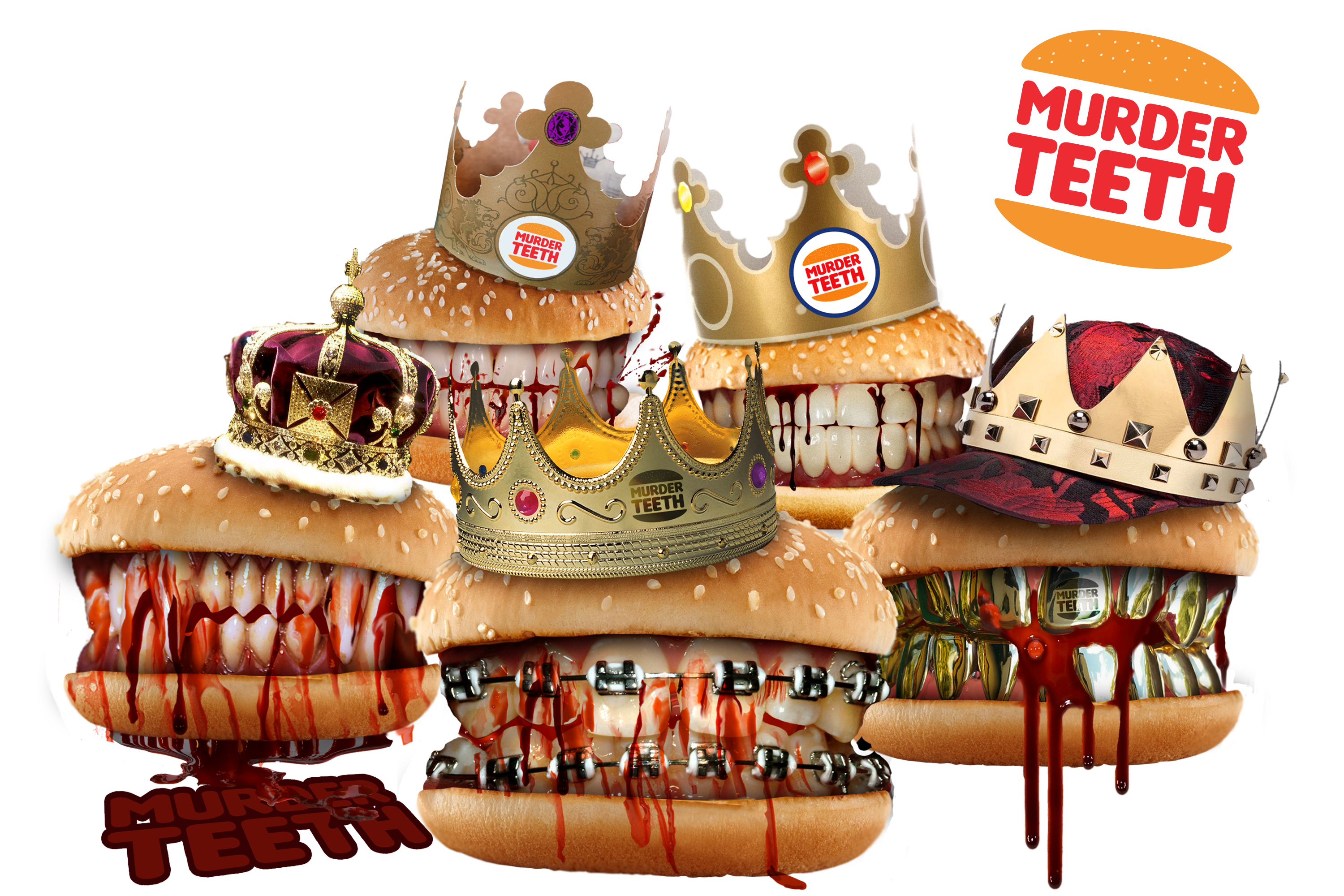
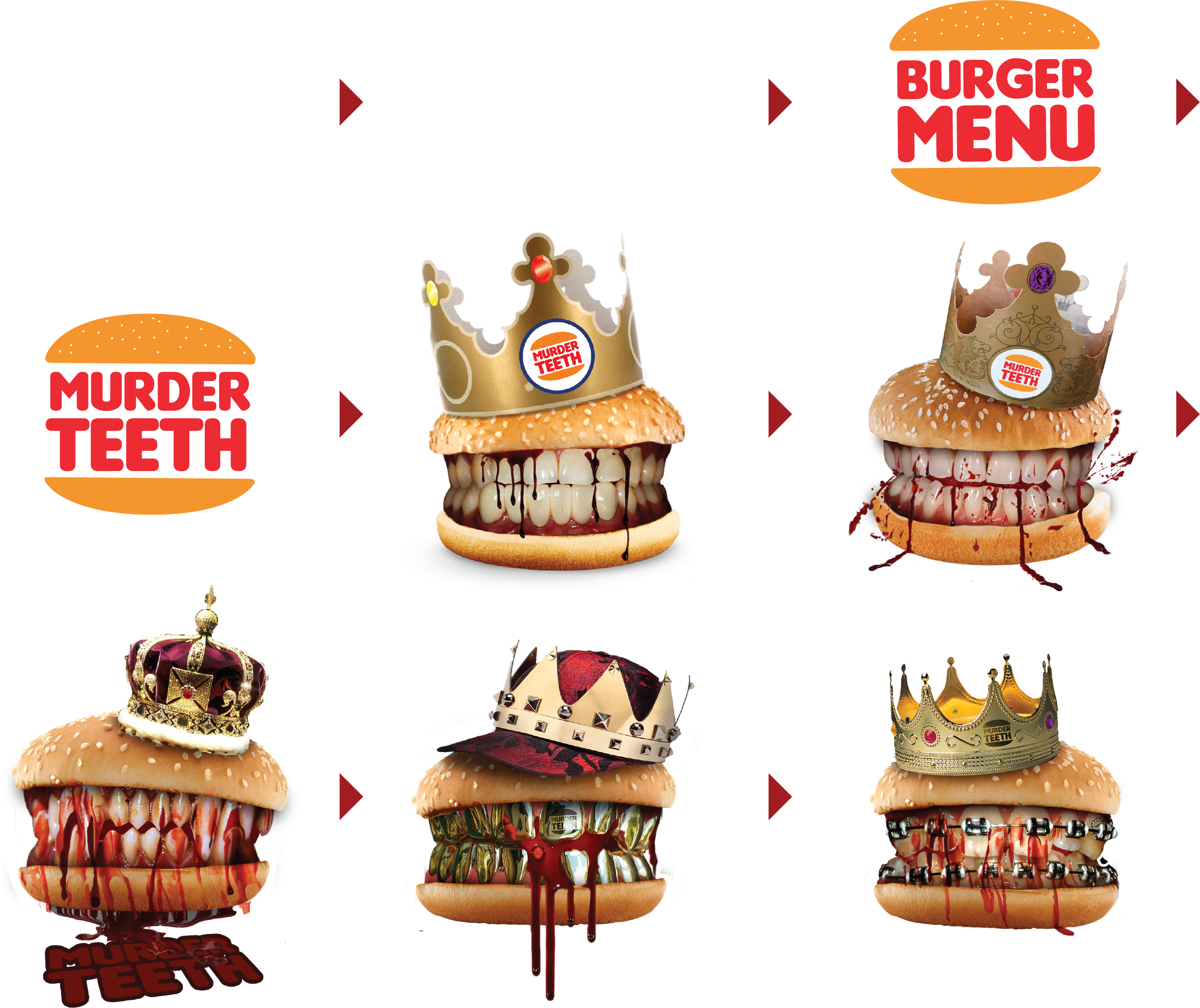
Murder Teeth
Murder Teeth began as a personal visual study and experiment in redefining pre-existing cultural space and using neuro-linguistic design. The project morphed into a series of T-shirt designs and then into an alternative advertising campaign we are trying to pitch to both Burger King & Peta, whoever bites first. :)
Murder Teeth
This idea has been evolving over time. It started out interestingly enough as an easter egg on a mobile application I made for a government subcontractor. The Hamburger Menu became a Hamburger, then a T-shirt Burger Menu, Then Murder Teeth, The the various iterations of the Burgers with bloody teeth.
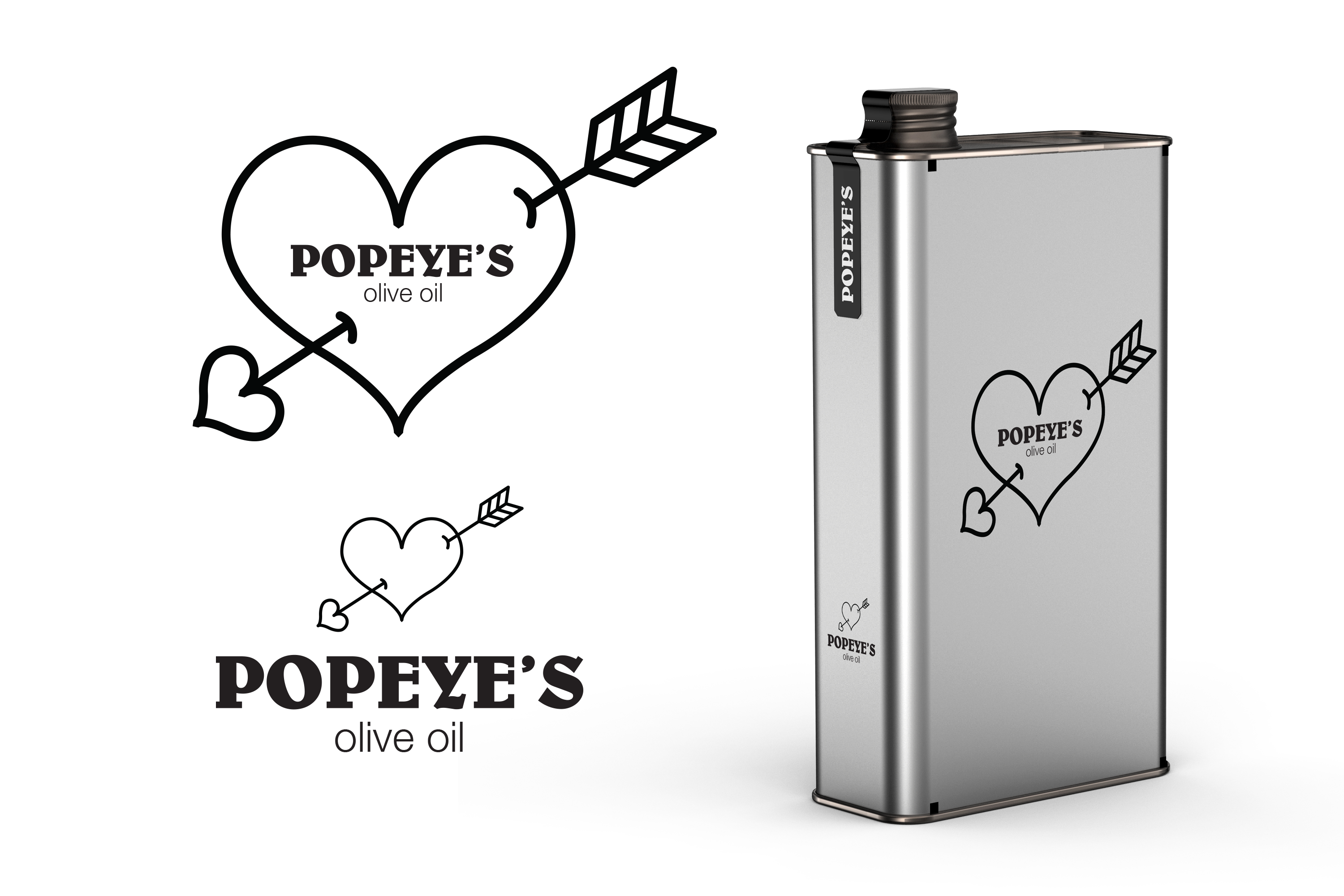
Popeye's Olive Oil
This is a private label Olive Oil Brand I have created and looking for a partner to launch with. Popeyes is an excellent example of word of mouth advertising, redefining pre-existing cultural space and using neuro-linguistic design to make a recognizable memorable brand that people will talk about. The olive oil is of a very high quality by itself but the branding and design adds value and marketability to the product.
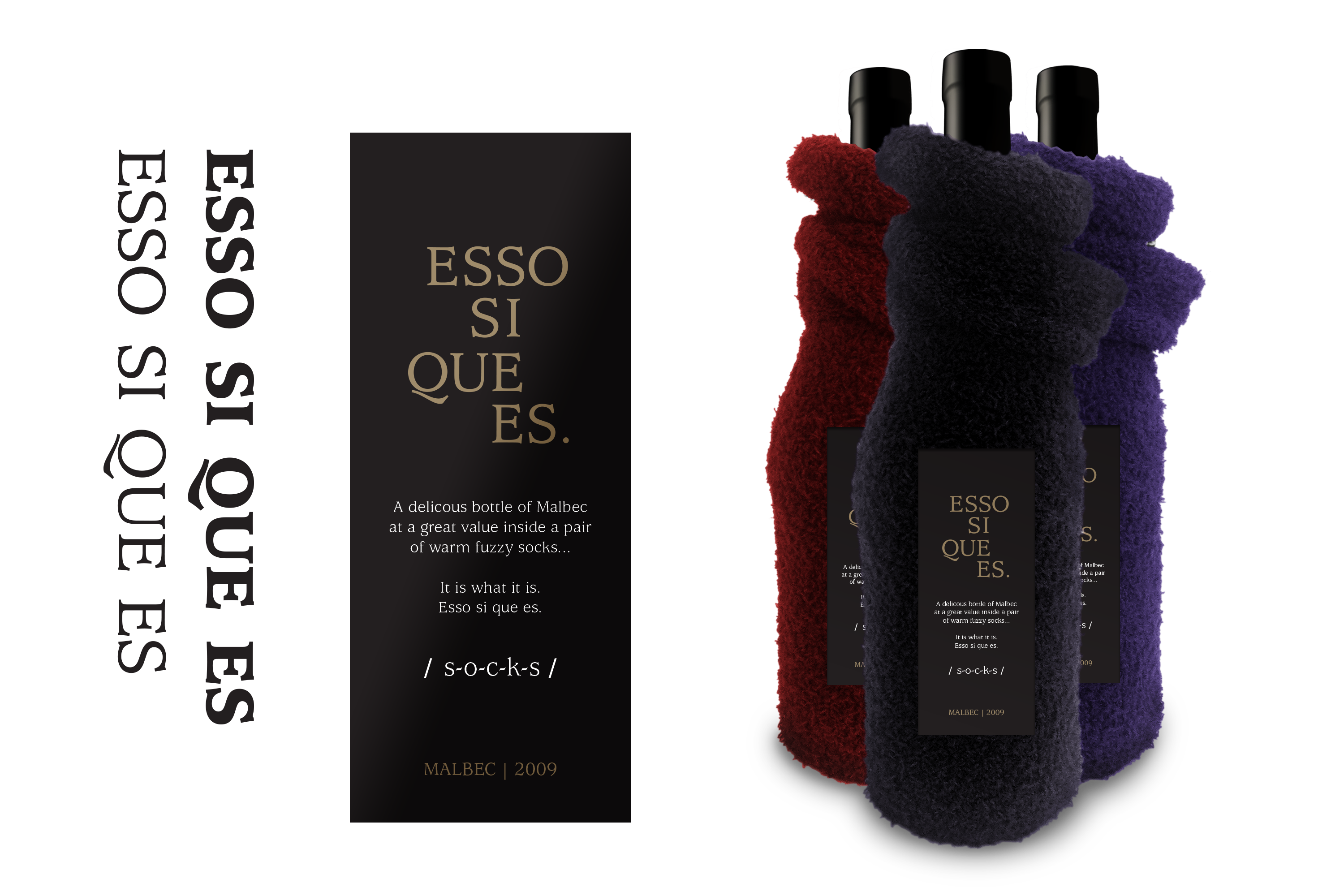
Esso Si Que Es.
While buying a pair of socks and a cheap bottle of wine in a Korean liquor store, I had an epiphany. Socks and wine go together! This is a great word of mouth marketing private label product. The unique packaging draws your attention on the shelf space and spurs your desire to touch the product with the tactile warm fuzziness of the socks. The name Esso Si Que Es is a mnemonic device used to learn Spanish. Esso Si Que Es pronounced S-O-C-K-S, it is what it is. A delicious bottle of Malbec at a great value inside a pair of warm fuzzy socks... It is what it is. Esso Si Que Es.
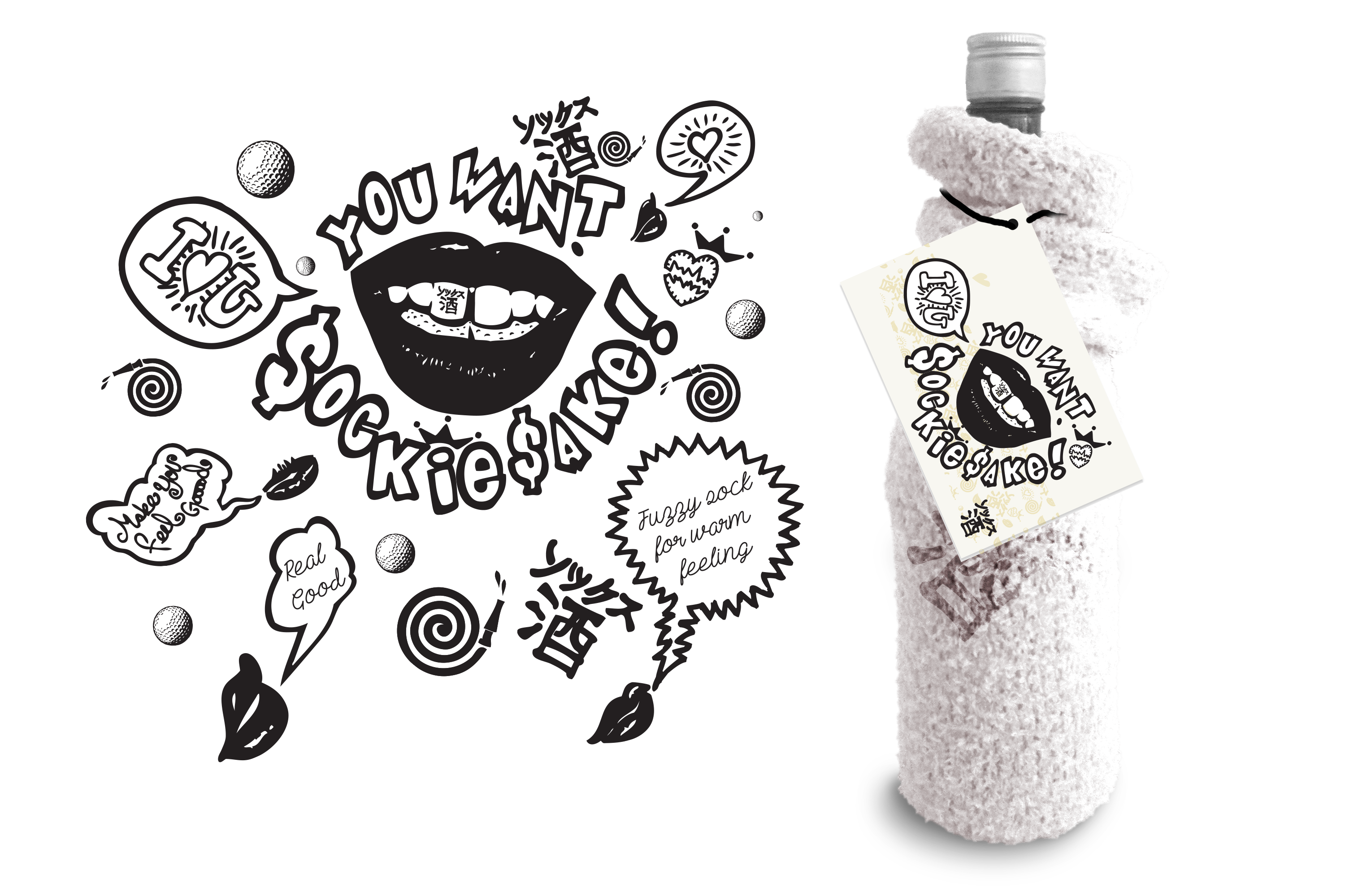
You Want Sockie Sake!
A variation of Esso Si Que Es with a slightly different target market. "You want Sockie Sake!" (the name is a call to action) is a high-quality private label Sake brand. A visual pun, and cultural reference (perhaps in bad taste, however the taste of the Sake makes up for it.) This brand has huge word of mouth advertising potential, tremendous shelf space potential and uses Neuro-linguistic design & tactile design to make a memorable impression on the consumer. Marketed towards the millennial wine lover tempting them into to the world of Sake. Looking for a Partner to launch this product with, I think it has huge potential
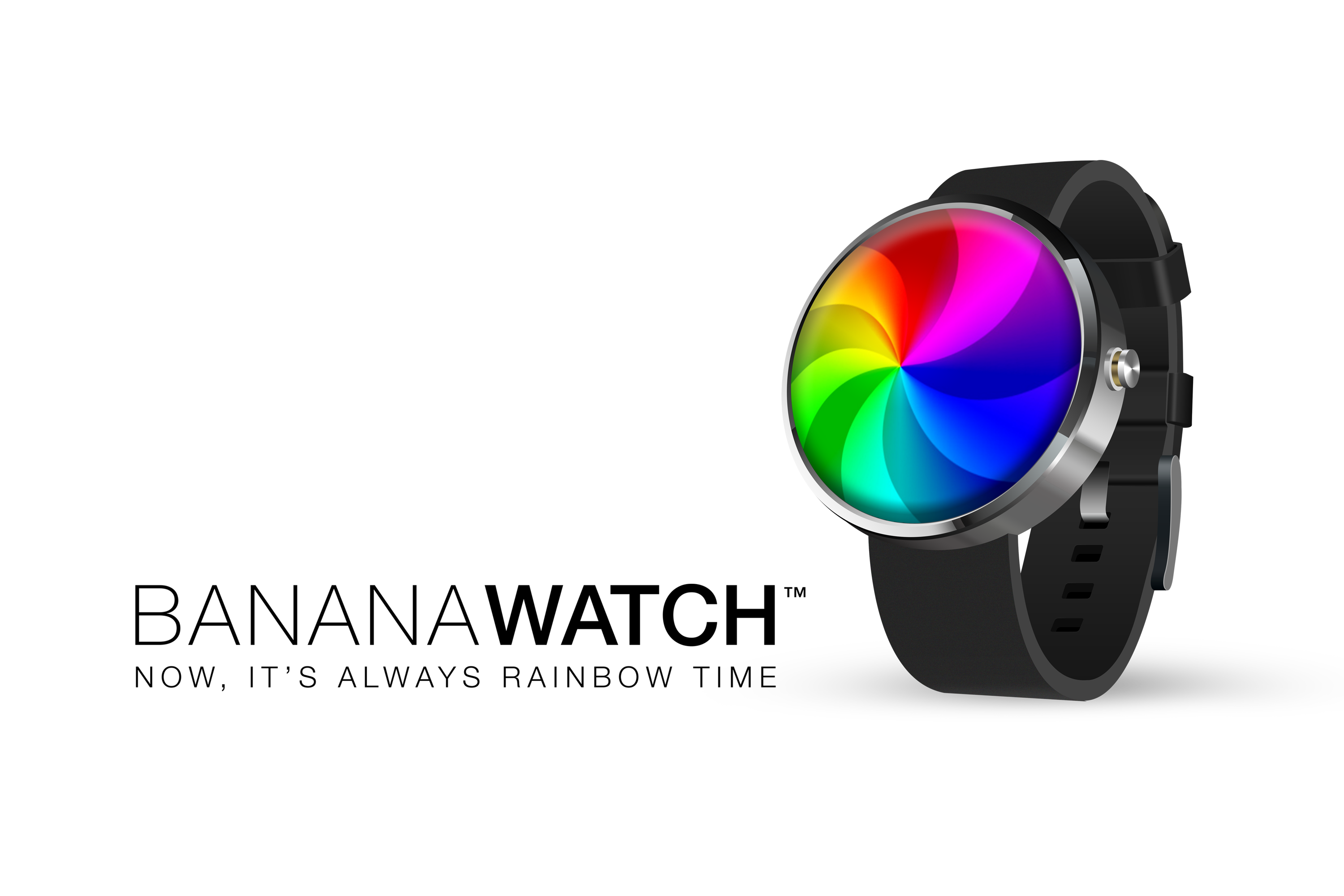

Banana Watch
A visual pun that became a product & a critique of the amount of time computers, devices & moderne systems waste. This take-off on the Apple watch & spinning beachball of death reminds us that many of the efforts designed to save time have, in the long run, had the opposite effect. It's also an eye-catching conversation piece. Now it's always rainbow time!
TSlurp
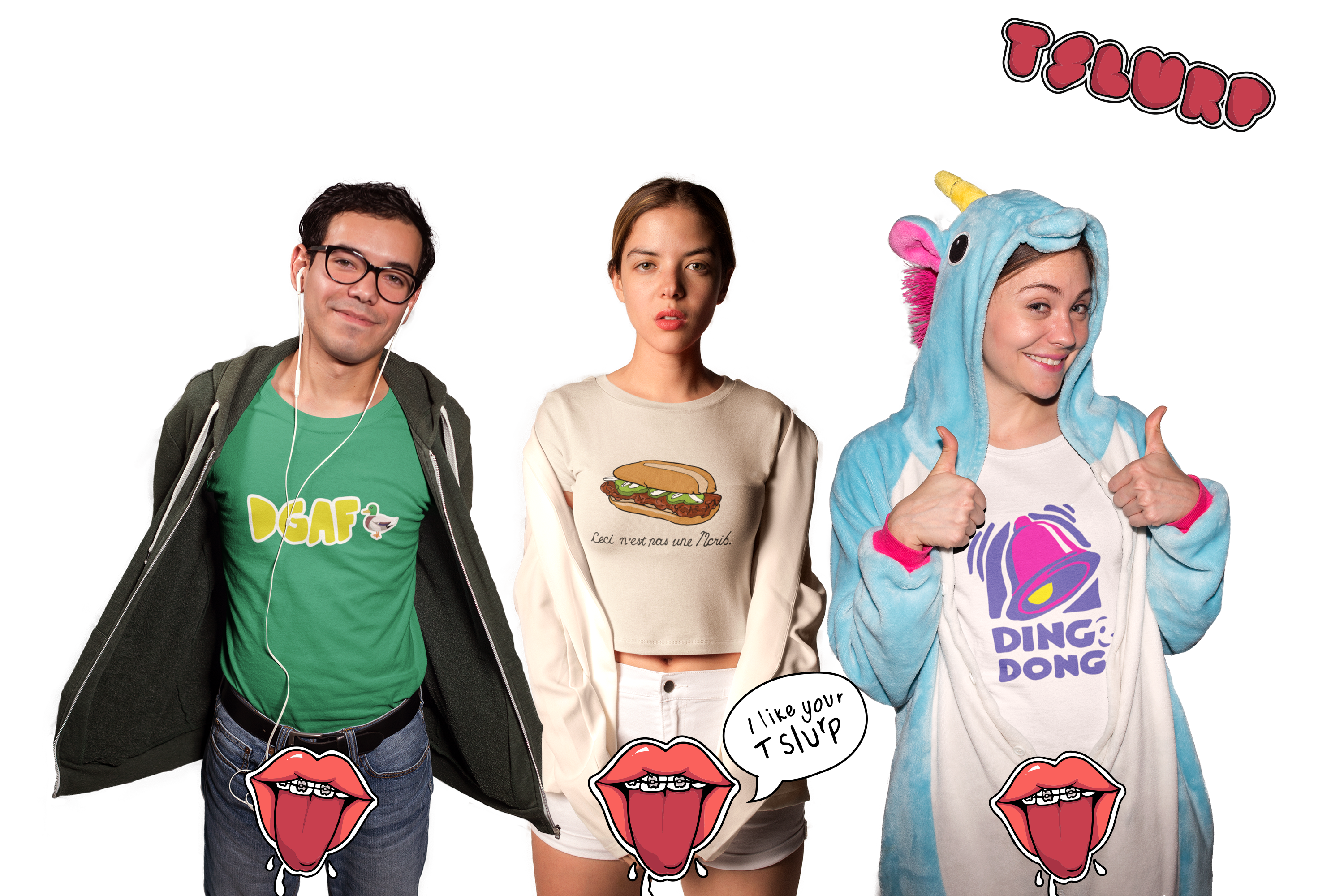
TSlurp is a T-shirt line marketed towards some very exciting markets: Tweens, Kidults & Quasi-homosexual Japanese (got to go where the money is). The current line is a collection of provocative and playful illustrations that incorporate neuro-linguistic design and repositioning pre-existing cultural space. I like your TSlurp!
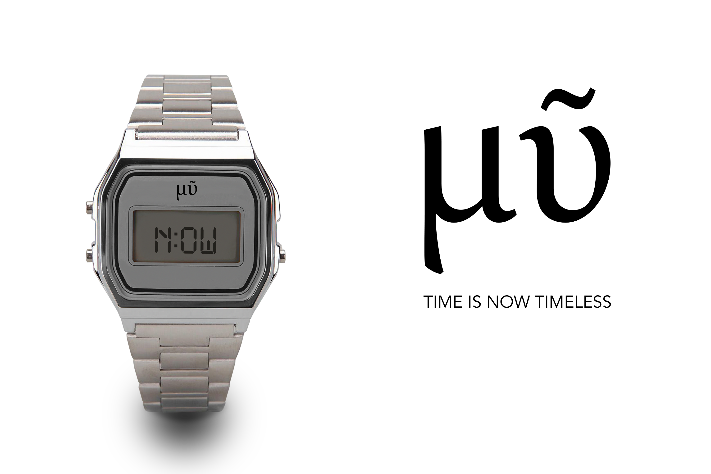

What time is it? Now. It’s always right now. Pronounced (mu) This is the only timepiece design to the display precisely the right time in all timezones simultaneously. Time is now timeless.
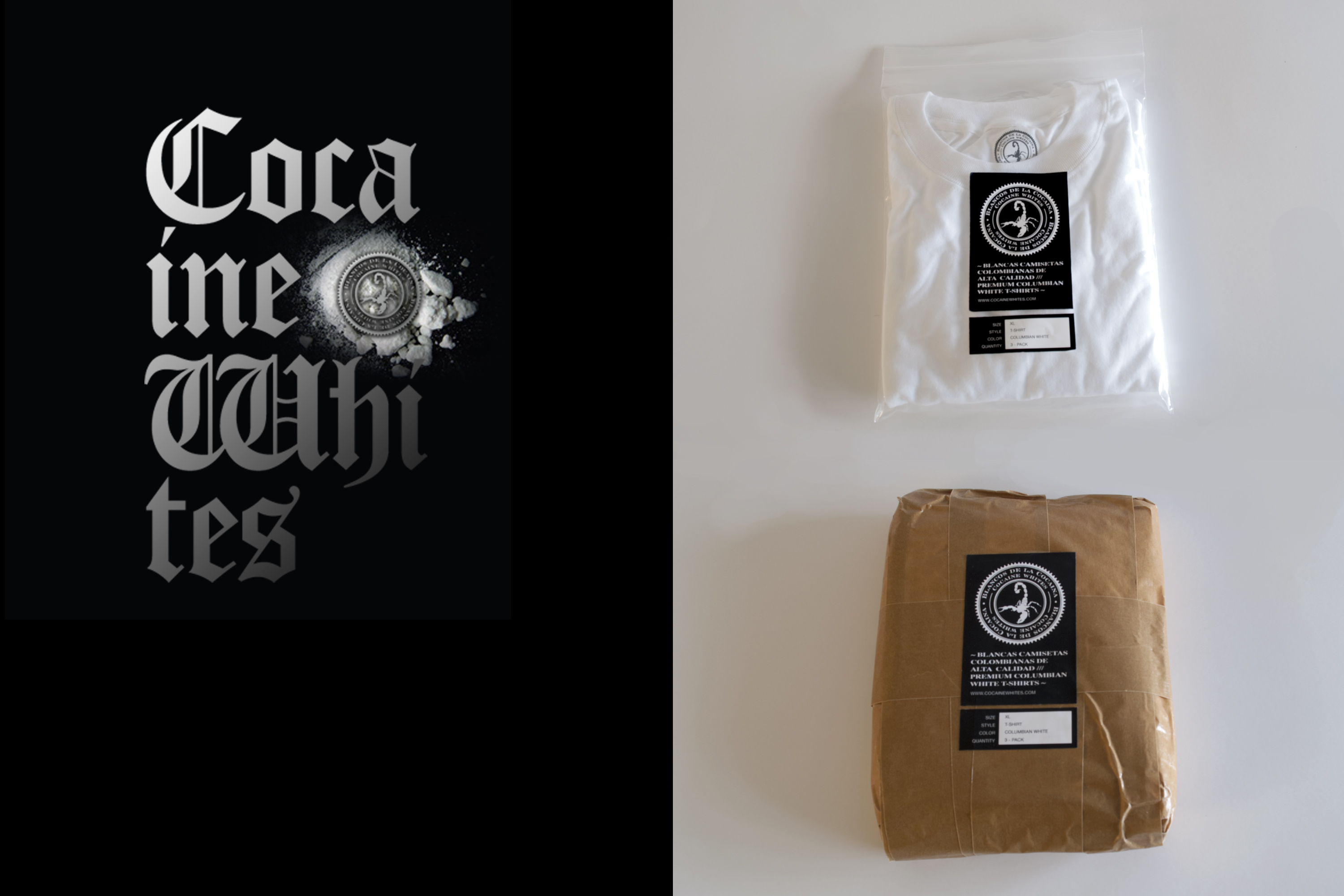
Cocaine Whites
Challenge: How can you add value to the classic blank T-shirt with only branding and packaging? I came across these DEA photos of a cocaine bust on the internet which showed a stack of kilos piled up with stamped with a primitive scorpion symbol. I thought this would be an excellent way to package the T-shirts. I refined the scorpion into a brand mark and created a bilingual branding system that was applied to the packaging promotion and website. The T's were embroidered with the scorpion mark and packaged as a 3-pack in a kilo wrap & individually in zip-lock bags.
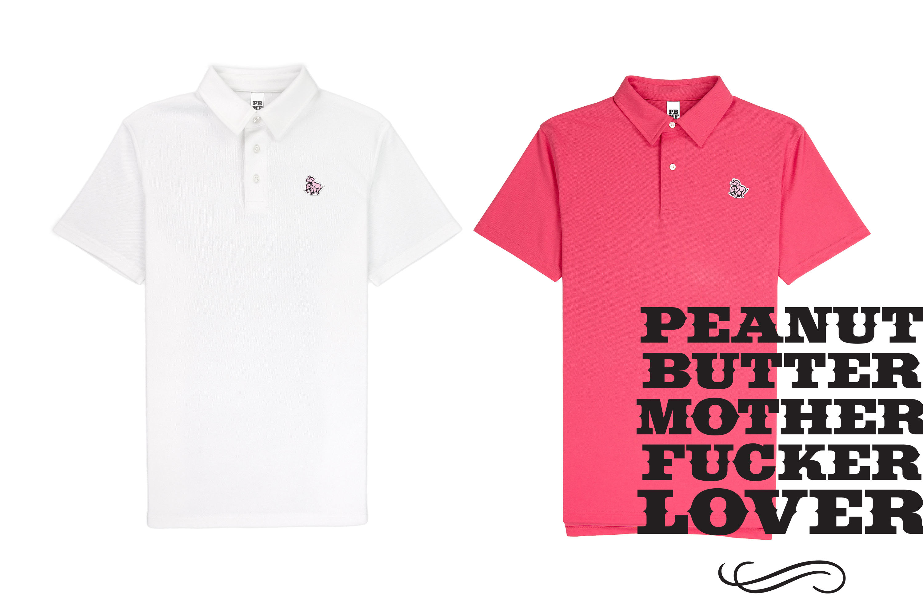
Peanutbutter Motherfucker Lover
Peanutbutter MotherFucker... it rhymes what else do you need to know? The current line consists of on demand, custom made high-quality polos with the original elephant appliqué. This juxtaposition of profane language and refined garment design makes this a very memorable and unique product with built in word of mouth advertising.
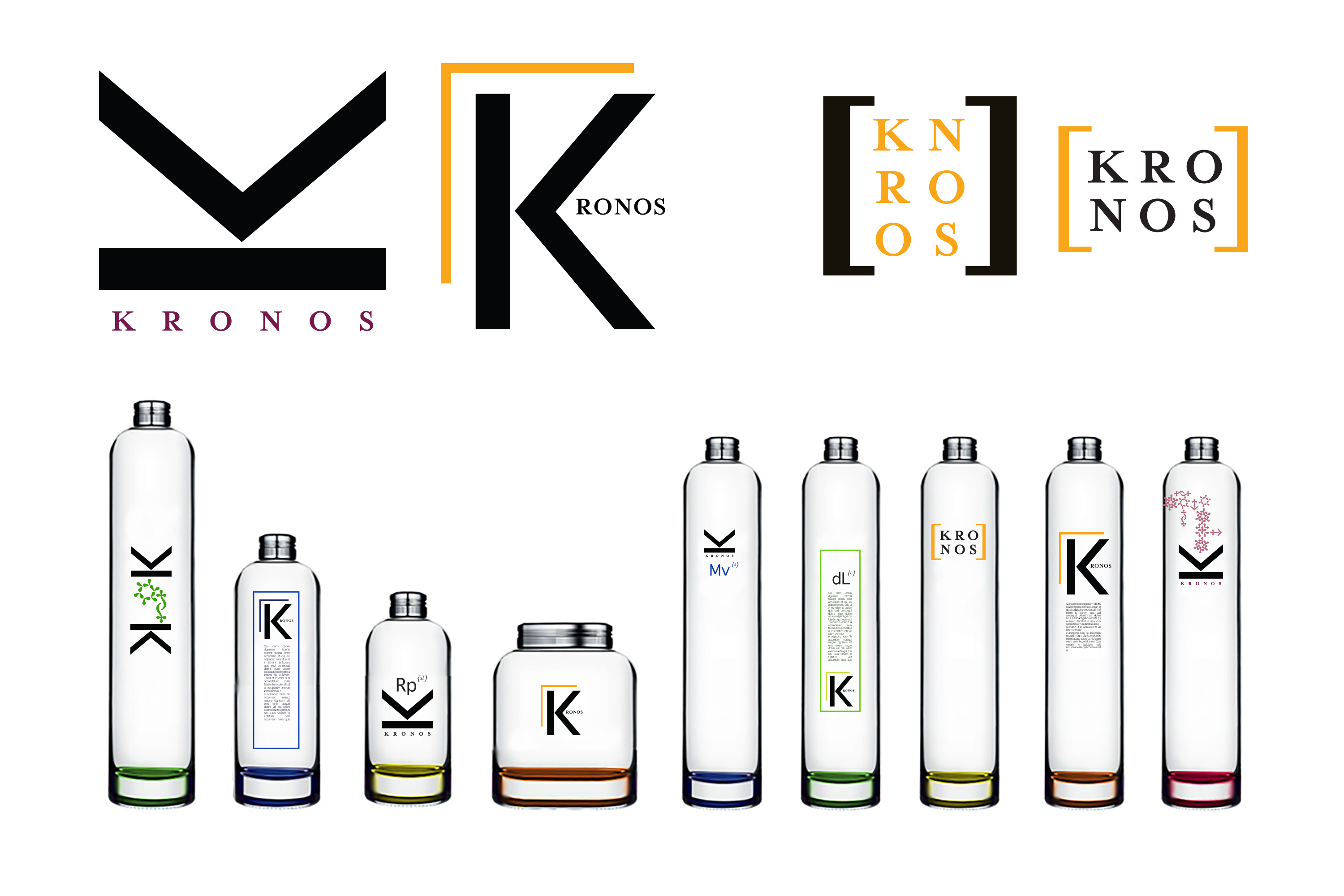
Kronos Branding
The owners of Kronos, a high-end hair care company, came to me with the name and a word document outlining the science behind the product. I collected color pallets, typefaces, made an imagery storyboard, researched possible packaging materials & wrote a short treatment on the brand's metaphors and emotional themes. I began creating possible logotypes, marks, and typographic treatments created a table of elements idea for combining products into groups, came up with naming ideas and created the possible bottle and packaging designs. I then edited and refined these into an inspirational style guide. That guide was executed by the in-house creative team. I had no input from that point on.
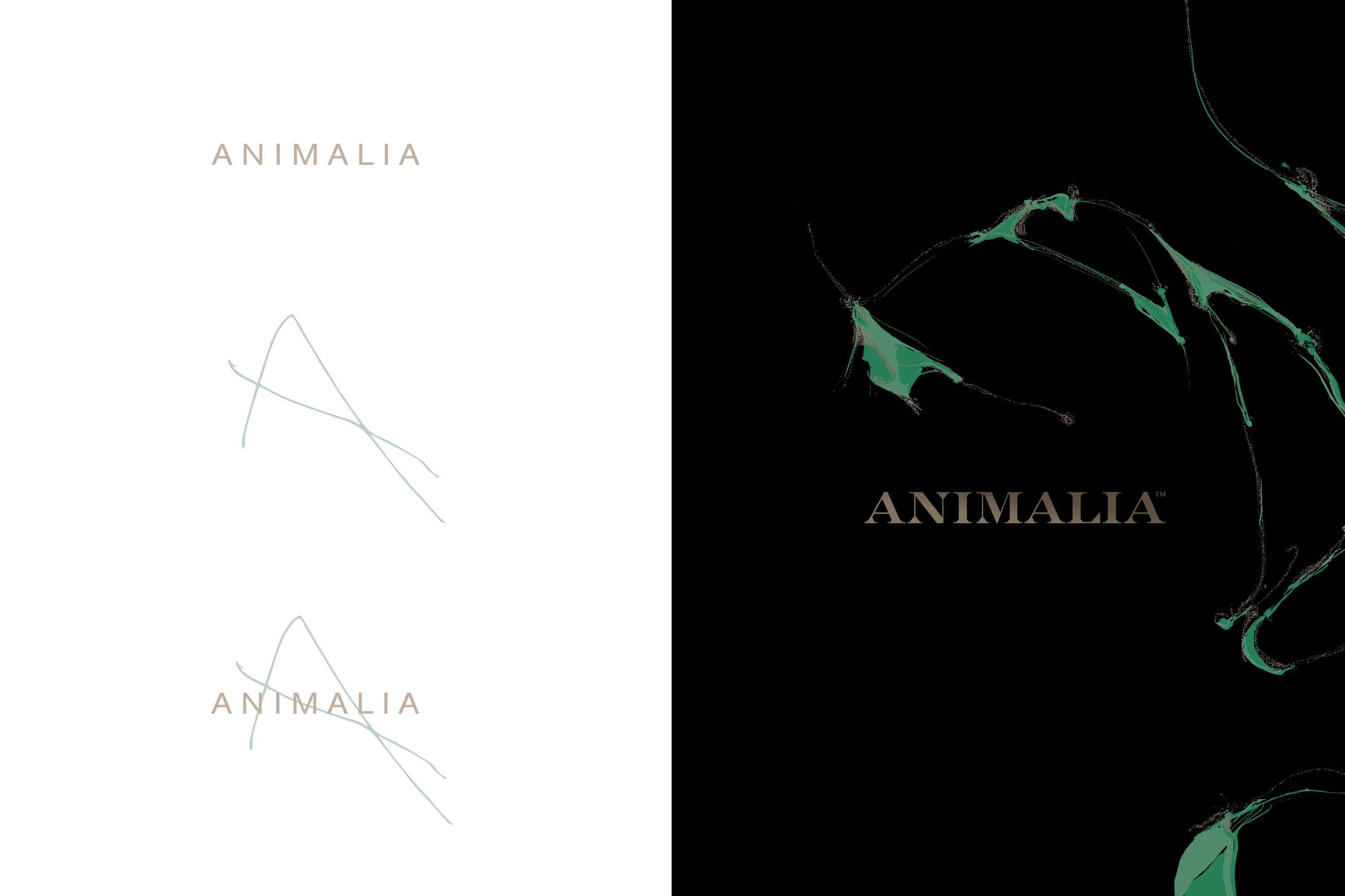
Animalia
Animalia is a collection of essential oil candles that have healing qualities. Displayed are the two original concepts I presented for the brand. The chosen direction in black on the right is a system of organic shapes inspired by the spirit of the essential oils. This system juxtaposed with a more traditional engravers typeface became the foundation of the brand. After the branding project was complete. I moved on to the packaging applying the organic shape system sculpturally to the product package. The product was later rebranded as Trees ritual I played no role in that variation of the product.
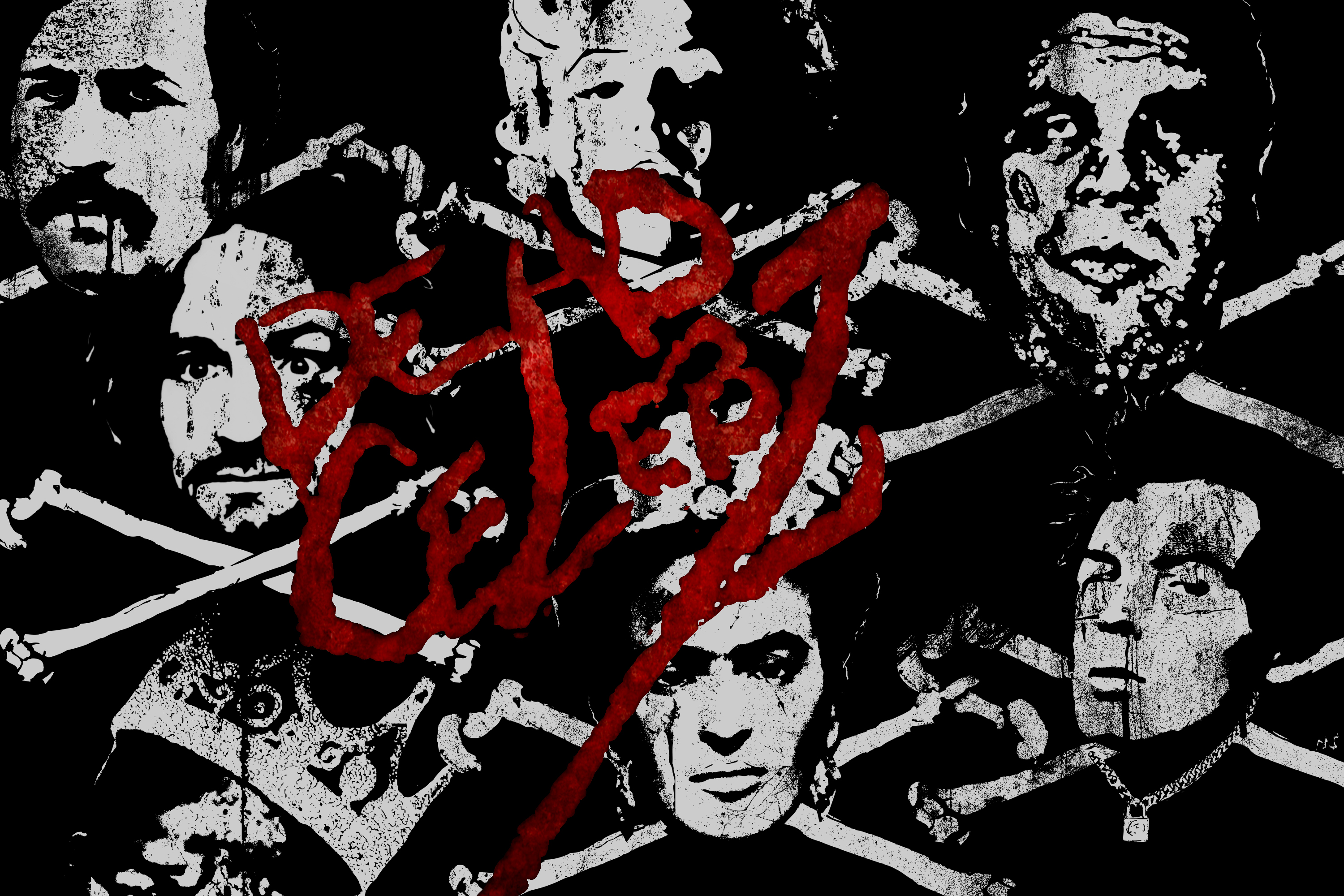
Dead Celebz
A brand inspired by punk culture & death, skulls, and destruction. It pays homage to both the memory of the dead celebrity, creates a new fictional character of the disembodied should of the celebrity in a Bardo realm and plays with the idea of the death of celebrity itself in a new world of social media stars.
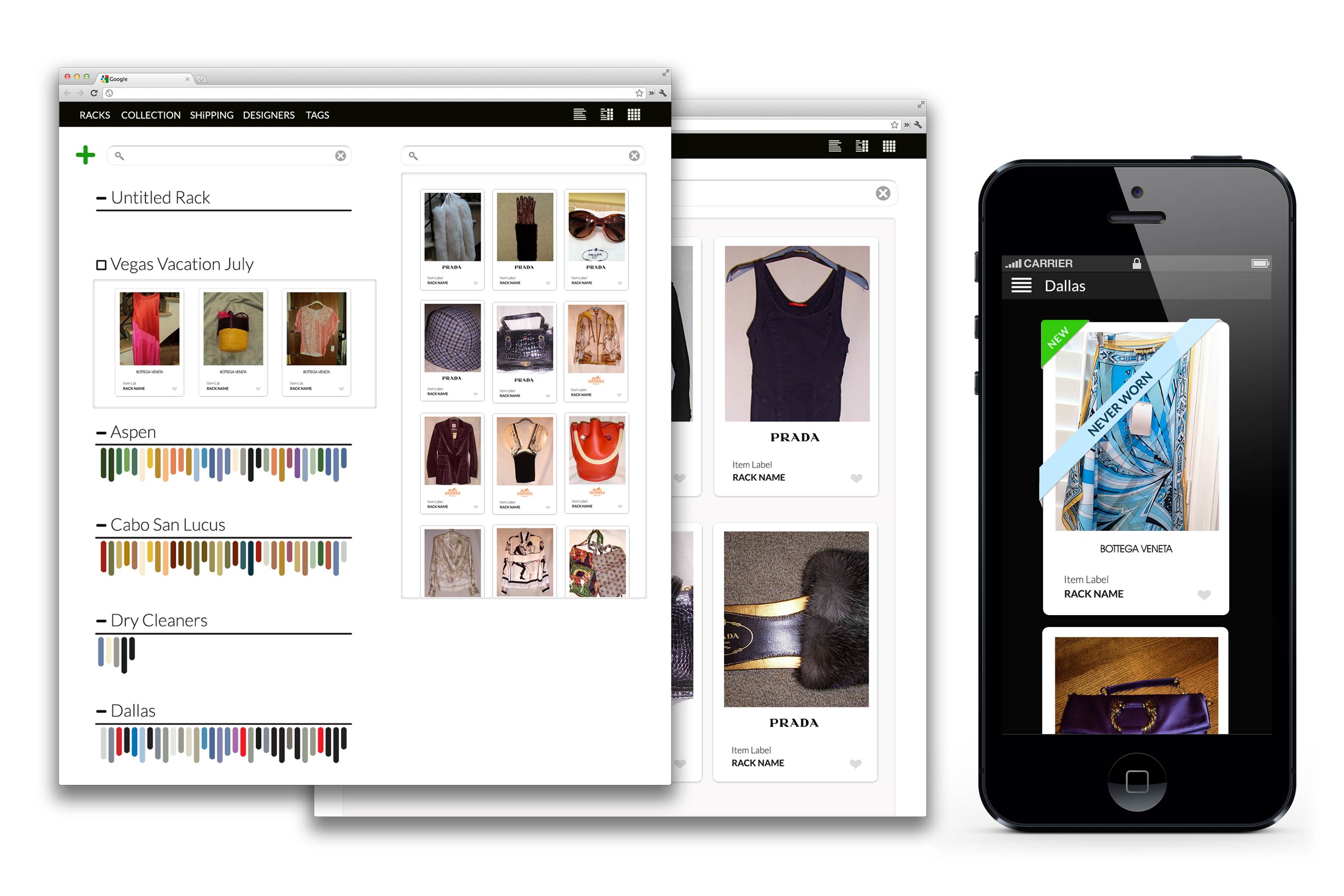
Collection Personal Custom Organization
A personal custom organization tool I created based on our Tree & Field digital asset management technology. Collection is a branded and customized digital product that caters to the retail and fashion enthusiast. It uses Artificial Intelligence & Blockchain technology to identify, track and visually organize apparel and accessories across multiple locations. Collection has a very intuitive easy to use drag and drop interface and flexible UI that allows endless combinations of organization. This software also has a huge potential for targeted in context and predictive advertising and direct sales. Looking for a partner to bring this product to the next level. A subscription service and advertising / e-commerce platform.
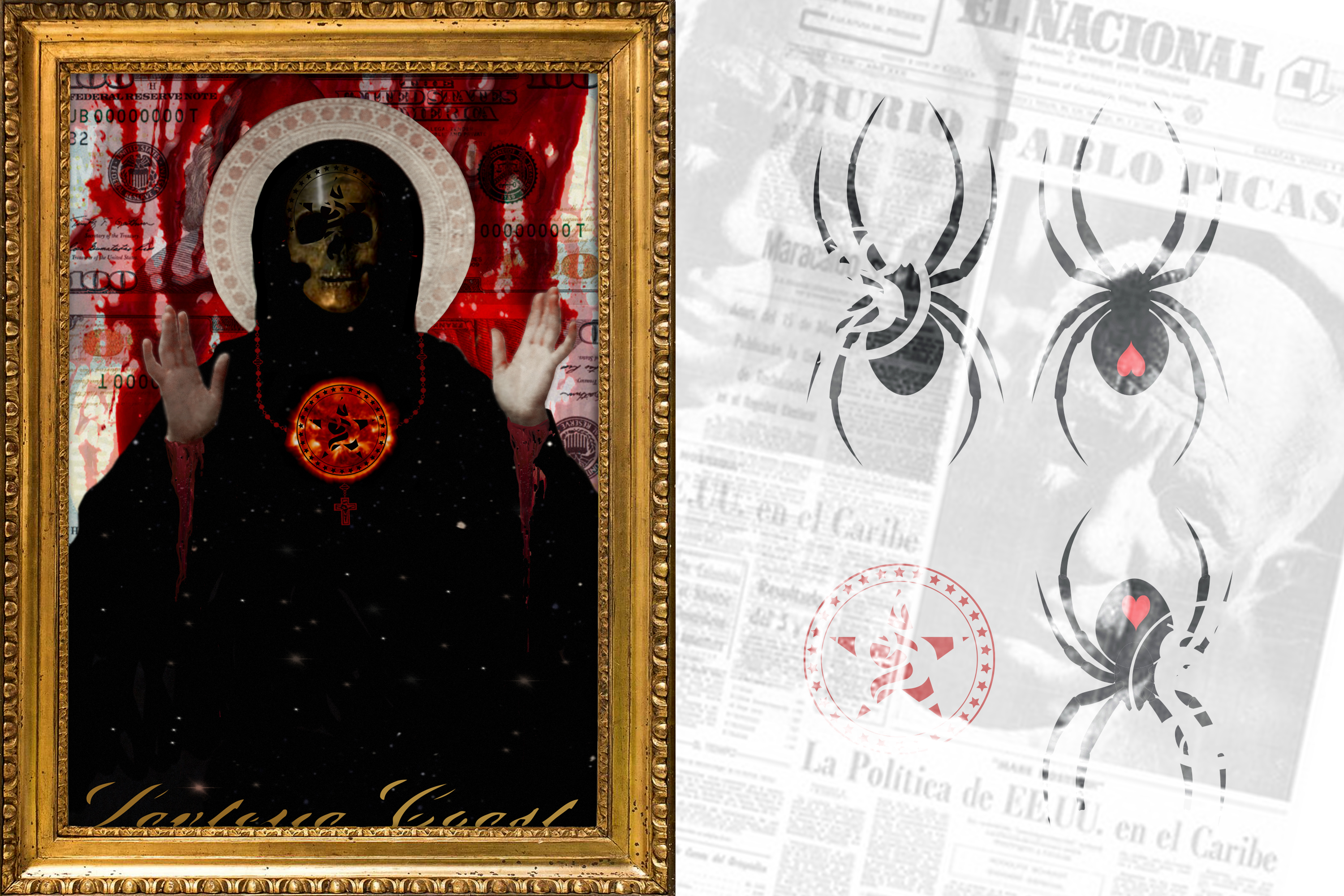
Santeria Coast
Santeria Coast was a personal Project that turned into a limited edition T-shirt line. I've always been interested in Latin Art, Culture & Religion. I began exploring this first graphically and then with trips to Mexico. I discovered a richness of symbolism and a primal energy in Santeria that grabbed hold of me. Santeria Coast became a brand as well as the place in my mind where all these symbols and forces resided.
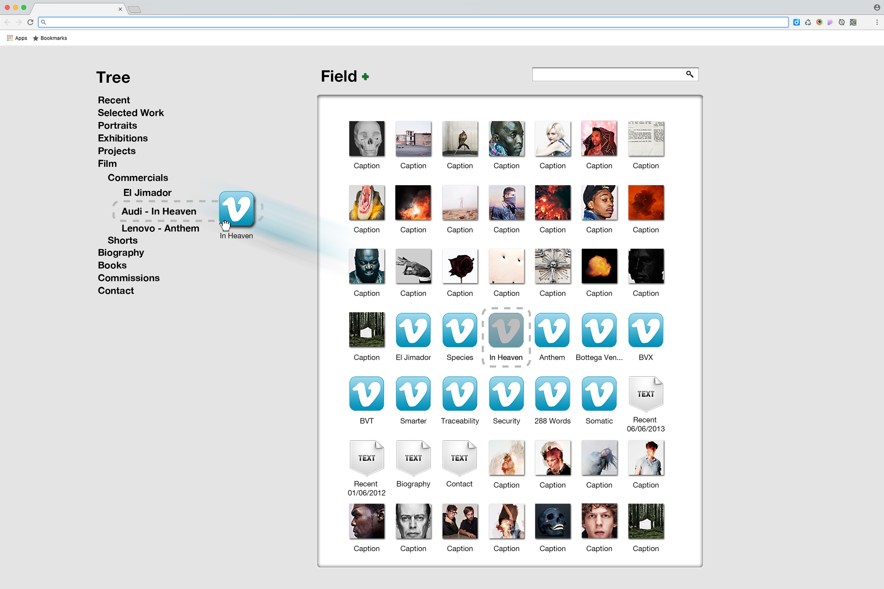
Tree & Field Digital Asset Managment
This system was originally developed as a CMS for a particularly challenging client that needed to track organize change and reorganize thousands of images very often & very quickly. Tree & field has matured into a drag and drop digital asset management system with the ability to publish directly to the web. It has an endless variety of applications.
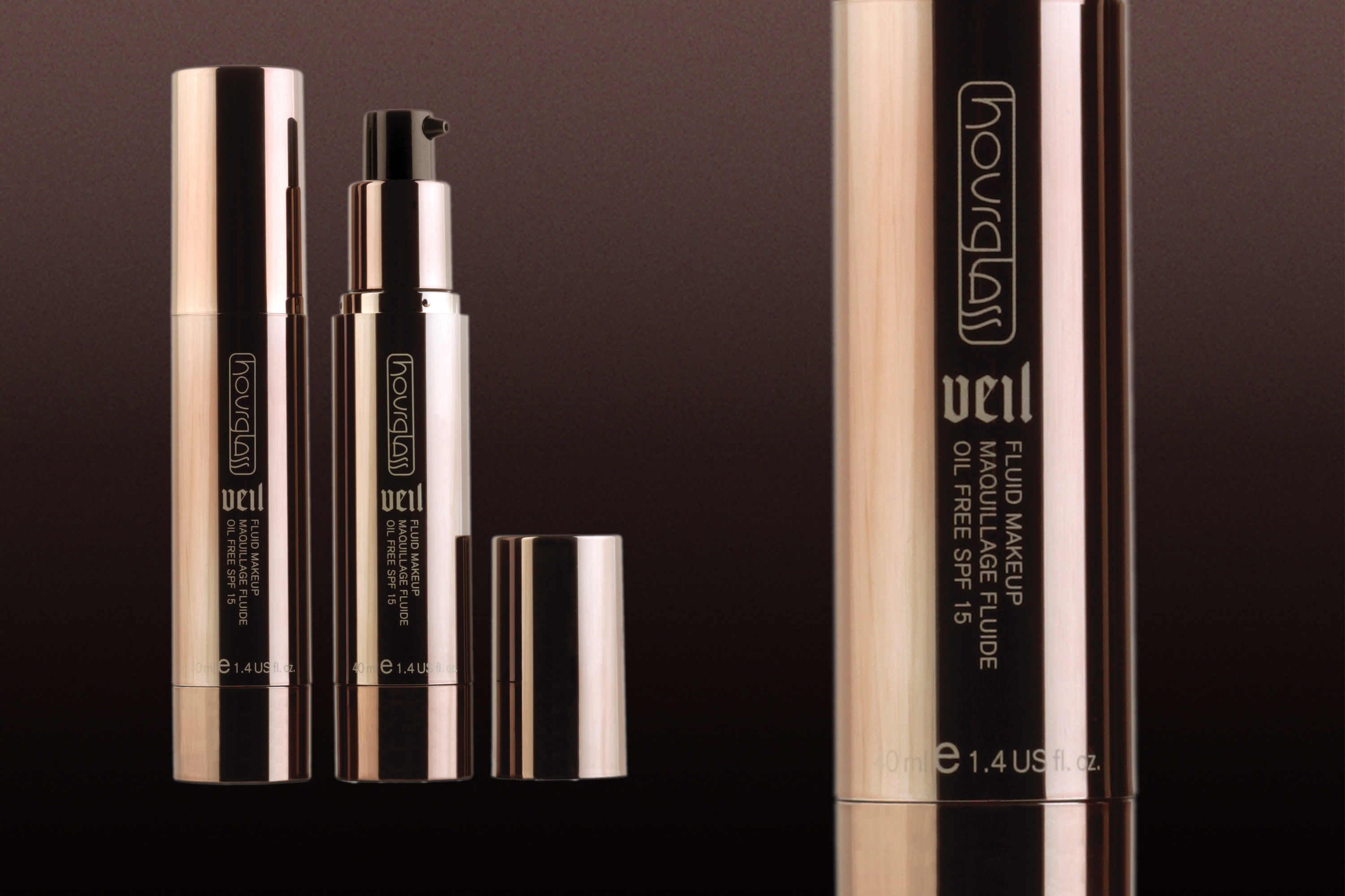
Hourglass
Over the Span of three years, I worked on multiple projects for Hourglass Cosmetics. The First phase of the project was extrapolating an Art Direction from the unfinished branding and creating a cohesive visual system for the products, packaging and promotional collateral. The second phase of the project was designing and developing the e-commerce website and online marketing campaigns.
